Logo Variations
Choose the appropriate logo variation based on your use case and background requirements.
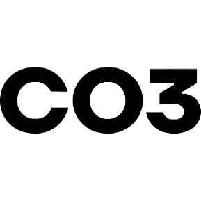
Logo Black PNG
Main logo for light backgrounds
Logo White PNG
Logo for dark backgrounds
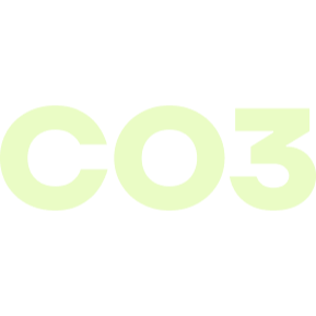
Logo Lime PNG
Alternative logo for dark backgrounds
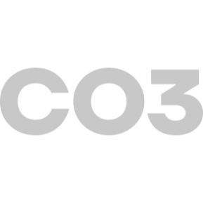
Logo Grey PNG
Alternative logo for light backgrounds
Backgrounds
High‑resolution hero backgrounds for headers and marketing materials.
Company Header PNG
Hero background for company communications
Personal Header PNG
Hero background for personal profiles
Brand Colors
Our official color palette ensures consistent brand recognition across all materials.
Primary Dark
#121A1B
RGB: 18, 26, 27
Secondary Gray
#C8C8C8
RGB: 200, 200, 200
Neutral Gray
#F8F8F8
RGB: 248, 248, 248
Accent Lime
#EAFCC5
RGB: 234, 252, 197
Typography
Our typography system is built on Helvetica Neue for clean, modern communication.
Primary Font
Main typeface for all brand communications
Font Family: Helvetica Neue
Fallback: Helvetica, Arial, sans-serif
Font Weights
Available weights for different hierarchies
Use Medium (500) for UI elements
Use Bold (700) for headings
Use Regular (400) for body text
Typography Scale
Consistent sizing for all text elements
Usage Guidelines
Follow these guidelines to maintain brand consistency and ensure proper logo usage.
Clear Space
Maintain minimum clear space equal to the height of the logo mark around all sides.
Color Usage
Use approved color variations only. Avoid placing logos on busy backgrounds.
Minimum Size
Never scale the logo smaller than 24px in height for digital or 0.5 inches for print.
Don't Modify
Never alter, rotate, or modify the logo. Use only approved variations provided here.